Typography as Art
The notion of typographical art usually involves a verbal statement that defines the theme or purpose of the artwork, and the statement’s legibility is a key to the purported success of the piece.
A statement of love, of anger, of protest, of political position: All and any of these topics and many more usually can be found in work categorized as being primarily typography.
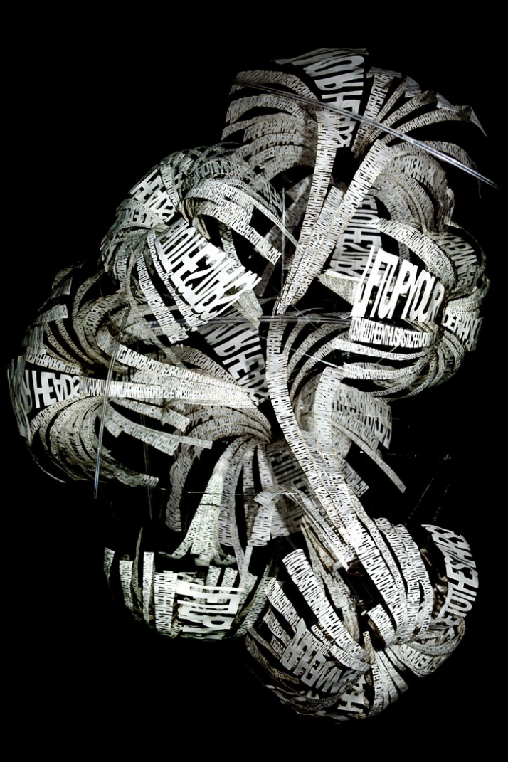
Ebon Heath’s typographical art, however, discards the typical florid poetry or simple declarative sentences in favor of images and sculptures more akin to digital word clouds … even though a closer examination of the component words makes it clear these are not random words sized according to their prominence or frequency in the piece.
The energy of the piece above is reminiscent of the murmuration of birds in flight, which I consider one of Nature’s most fascinating phenomena. (Murmuration was one of the early puzzles decoded by mathematician John Forbes Nash Jr., portrayed in the movie, “A Beautiful Mind.”)
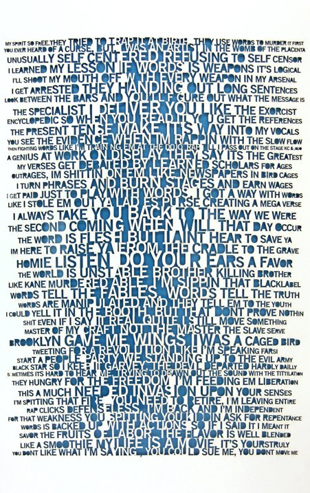
The work above is closer to what’s expected in a piece of typographical art, though its message is enigmatic because of the typography. Do we read every word from upper left to lower right? Do we read words of similar size and font, especially the larger, bolder ones in what could be considered a middle column of type? Both ways? And are there other ways? How does the message change, or does it?
Each of these artworks, and others by Heath, challenges conventions about typographical art. They can be analyzed, interpreted and re-interpreted, or they can be appreciated for their overall power and beauty. I choose all of the above.
Leave a Reply